Simplifying Your Site: Why Less is More for Visual Creators
The most successful creatives aren't drowning in options: they're focused on sending clients a clean page with their best work and a clear CTA. Learn how!
Molly Shelestak
Author

Creative freedom is awesome—until it eats your week.
When you're trying to get booked, too many choices turn simple decisions into projects. That's the paradox of choice. For visual creators, speed wins. Show your work fast. Make the path to "Book now" obvious.
Outli.ne isn't about complex web design. It's about getting someone from first swipe to "Book" in as few taps as possible—by putting your work first.
The most successful creatives aren't drowning in options: they're focused on the next booking. While you're weighing templates, they're already sending clients a clean page with their best work and a clear CTA.
The Choice Paralysis Problem
You'll see 800+ templates before you've uploaded a single photo. Helpful in theory, time-consuming in practice.
Swapping templates mid-build is tough and often means redoing work. So the first pick starts to feel permanent, and the scroll begins. One more template. One more tweak. One more hour.
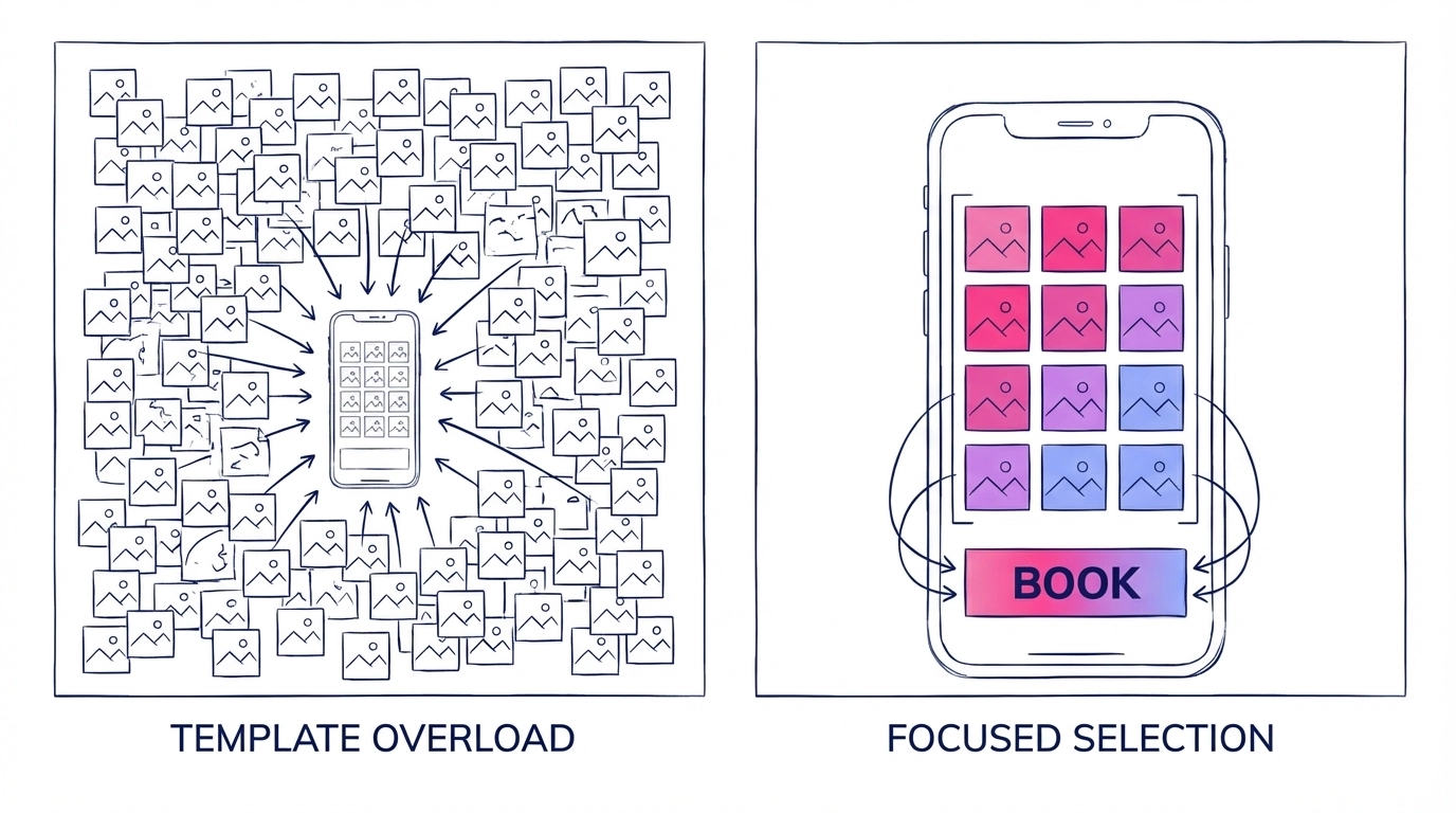
Ask yourself: how many sessions have you spent comparing layouts instead of picking your 12 strongest images? That time adds up. Your work doesn't need perfect framing—it needs to be seen.
The Customization Mirage
Drag-and-drop looks friendly until you're deep in spacing, fonts, and mobile tweaks. Tiny moves can throw off your phone view. Then you spend another hour fixing breakpoints.
Common time sinks once you're in the editor:
- Nudging spacing and alignment across pages
- Testing font pairs that don't change conversions
- Rebuilding layouts so they hold on mobile
- Recoloring elements that looked different on your phone
All that energy goes to the wrapper. Meanwhile, your work—the thing that gets you booked—waits.
The Performance Trap
Every "unlimited" feature adds one more decision you have to make. More galleries, more sections, more widgets—more choices to maintain.
Quick reality check: big galleries create curation paralysis. Which 12 images lead? What order? How do you group styles so a first-time visitor finds the right thing in 30 seconds? That curation alone can eat an hour.
Upgrading doesn't fix this. The real tax is attention. The more pieces you add, the more time you spend tweaking instead of getting booked. Visitors feel it too—too many paths means fewer clicks on "Book".
The Pricing Maze
Comparing tiers across site builders can eat hours you could spend curating. Outli.ne keeps it simple so you can move fast.
What simple pricing looks like in practice:
- One portfolio that puts your work first
- Clear CTAs that convert on mobile
- Edit from your phone in under a minute
- $4/month (annual) or $5/month (monthly)
Less comparing. More booking.
Integration Limits
Different builders solve different jobs. Many prioritize all‑in‑one features; others play nicely with the tools you already use. Outli.ne keeps your portfolio focused and lightweight, so it complements the rest of your stack.
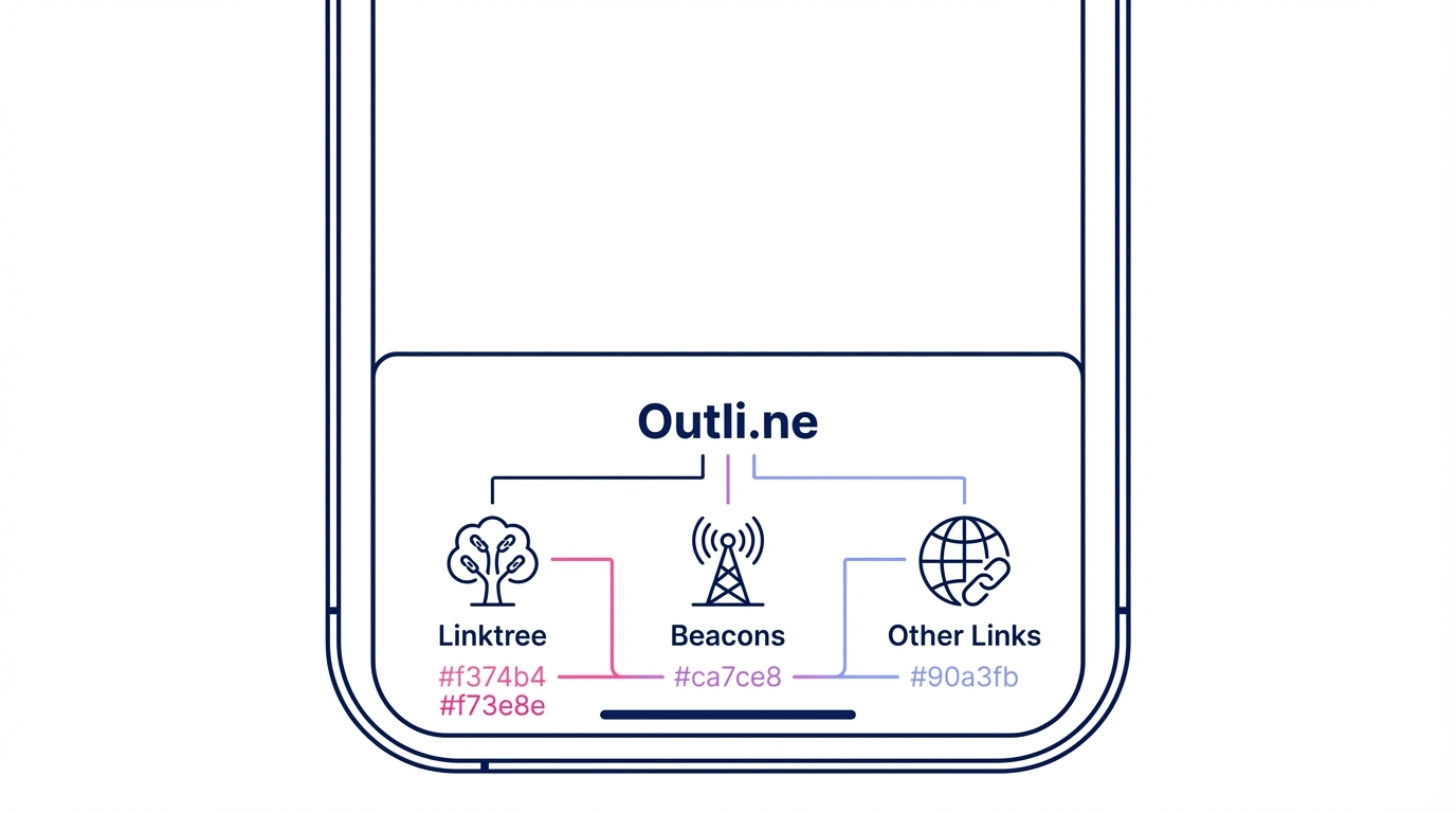
Most creators link their existing link-in-bio (Linktree, Beacons, etc.) right in the Outli.ne footer and keep it moving. Less setup, fewer add‑ons, faster shares.
The Real Cost: Lost Opportunities
While you're deep in settings, potential clients are deciding who to book. They won't wait for a perfect layout.
Every hour spent tweaking is an hour not spent:
- Curating the work that sells your style
- Following up with inquiries and referrals
- Shooting, styling, or editing your next piece
- Updating availability so clients can book now
The quiet truth: your tool should disappear. Your work should do the talking.
Why Simple Wins
Look at the pros you admire. Clean pages. Strong images. A clear path to book. They aren't showing off web chops—they're getting hired.
The best booking pages share three things:
- Speed — they feel instant on mobile
- Focus — your work is the star
- Clarity — the "Book" button is obvious
Unlimited options can make it easy to chase design tweaks instead of outcomes. Simplicity keeps you and your visitors on the same track: see the work, book the service.
The Alternative Path
Skip the complexity. Smart creators are choosing tools that show work first and put the "Book" button where thumbs expect it.
They're not spending weekends learning web design. They're not googling late‑night fixes. They're updating from their phone in minutes and sending a link that converts.
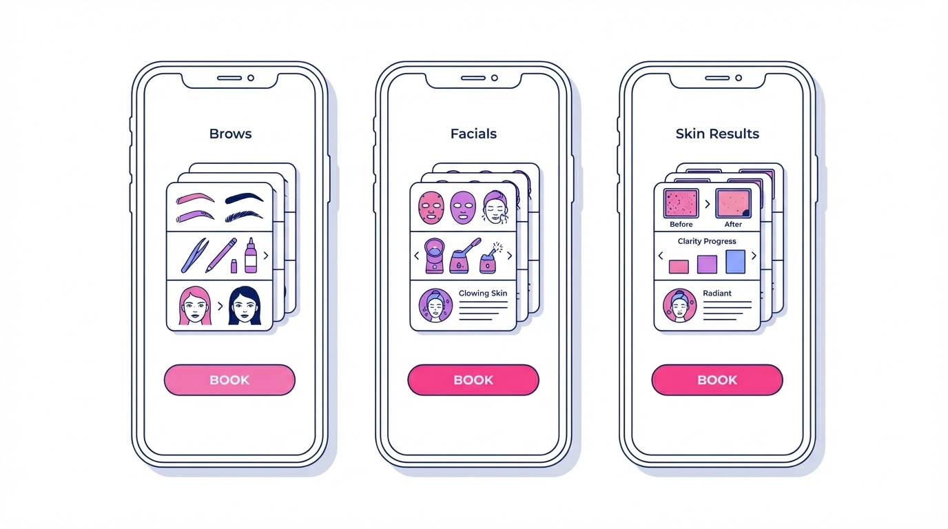
Example: Spirit Skin Artistry—a holistic esthetician and brow artist—keeps 3 simple stacks (Brows, Facials, Skin Results) with one clear "Book" button. Clean, fast, and easy to update between clients.
The question isn't, "Can I build something complex?" It's, "Does this help me get booked faster?"
Your portfolio should work as hard as you do. It should turn visitors into clients without extra steps.
Ready to build a page that gets to "Book now" faster by showing your work, not hiding it behind menus? Create your Outli.ne — starts at $4/month billed annually.
Ready to Transform Your Online Presence?
Join thousands of creative professionals who've switched to Outli.ne and started booking more clients.
Get Started FreeEnjoyed this article?
Share it with others who might find it helpful
More in Profile Optimization

Swipeable Portfolios vs. Traditional Galleries
Pixieset is excellent for delivering photos. For showcasing and booking, a swipeable portfolio reduces steps and keeps attention on your best work. Learn more!

Outli.ne vs. Squarespace: Choosing the Right Tool for Your Visual Portfolio
While you're spending three weeks wrestling with templates, your competition just launched their portfolio in 15 minutes and started booking. Learn how

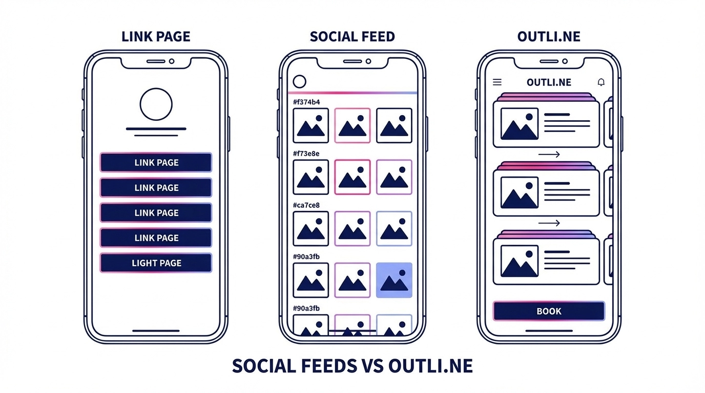
Linktree vs Portfolio Websites: Which Actually Books You More Clients?
Every day, thousands of talented photographers, tattoo artists, and makeup artists send potential clients to a Linktree page or a portfolio. Learn what books!